Previous posts in this series looked at how the transition from cars to a more multi-modal transit system – focusing on bikes in particular – has taken off in the modern world. Motivated by issues as dramatic as climate change or as common as economics, city governments have increasingly looked to bikes and transit for affordable and sustainable ways to facilitate their residents’ movement within and across city boundaries. Yet even in the presence of such great challenges, it’s worth making well-informed decisions about how to invest in these new transit modalities with the best resources available. In this post we look at one such method, The Propensity to Cycle Tool, through a substantive and technical lens (Lovelace et al. 2017).
About the Propensity to Cycle Tool
In their October 2014 “Cycling Delivery Plan”, the United Kingdom’s (UK) Department for Transport set the goal of doubling the number of cycling trips in the country by 2025. Additionally, they made a stretch goal for England and Wales to match the proportion of trips cycled in the Netherlands – over 25%! This foundational reimagining of how Brits get from A to B requires a wholesale reimagining of transportation infrastructure. Indeed, the aforementioned plan aspired to double the funding for walking and cycling infrastructure in an effort to add teeth to their goal.
Several strategic problems arise in determining where and how to allocate new funds for the development of new bike infrastructure or promotion and education of bike use. Consequently, the Department for Transport allocated funds to research where and how Brits currently cycle across the island, so that future investments could take this information into account. In particular, they wanted to prioritize those areas where cycling could make the greatest gains in the shortest time. This work, coordinated across several UK universities and the Department for Transport, culminated in the propensity to cycle tool (PCT). The PCT was first launched in 2015 and is still being developed and used today to assist policymakers in their larger goal of facilitating cycling as a means of transit.
Digging into how this tool works and the kinds of questions it strives to answer can give other researchers and transportation workers across the world a chance to learn from their insights, improve on their methods and further the global cause of making it easier to get from A to B in a safe, efficient, affordable and sustainable manner!
The Data
There are several data sources fueling the PCT with the UK census first and foremost among them. The UK census, much like the US census, is conducted on a regular basis in order to determine the number of individuals living across the country so that government resources can be proportionally allocated. The PCT uses two particular questions asked on the 2011 UK census to determine where and by what mode of travel respondents traveled to their place of work:
“In your main job, what is the address of your workplace?” (question 40)
and
“How do you usually travel to work? (Tick one box only, for the longest part, by distance, of your usual journey to work)” (question 41).
The answers to these questions allowed the researchers to estimate the likely routes respondents would take to work and the corresponding hilliness and distance of the route. Additional answers with information for other characteristics – e.g. sex – allowed the authors to better estimate how and where UK citizens might cycle to work varies across other dimensions. Additional data was calculated using the routing algorithms provided by cyclestreets.net, which provides estimates of “fast” and “quiet” routes between origins and destinations. “Fast” routes refer to the most direct routes that might favor less comfortable streets for cycling like major roadways. “Quiet” routes refer to the route that is most comfortable with the lowest amount of car traffic, regardless of distance. Using this route data also allowed the authors to calculate “hilliness” or elevation gradients for specific routes and their distance.
Propensity to Cycle
Where and How Many?
The researchers look at the propensity to cycle in a number of ways. To begin with, they use the raw counts and residential locations of the UK citizens to determine how many individuals cycle in a given Metropolitan Super Output Area (MSOA) – a geographic census designation analogous to a census block in the US. This spatial aggregation allows policy makers to look across the UK or more specific zones of interest and understand how many individuals are using their bikes to get to work. A spatial visualization of these aggregations is the first thing visitors see on the pct.bike website (Figure 1).
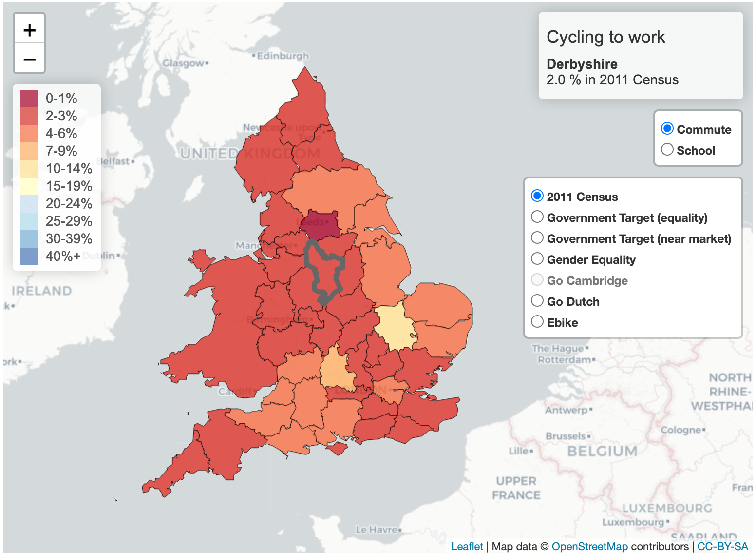
Figure 1: Example Visualization from PCT website
The researchers next identify the conditions under which a UK citizen is more or less likely to cycle a given “trip” as a function of their sex, trip distance and trip “hilliness” or gradient.
Why and How?
The authors propose a series of models for estimating the propensity to cycle, \(\pi\), as a function of route distance, \(d\), and gradient, \(g\), across various scenarios. These all start with the following form:
\[ \text{logit}(\pi) = \alpha + f(d) + h(g). \]
The logistic regression outlined above allows the authors to identify to what extent distance and hilliness plays a role in determining whether an individual decides to cycle to work or not. You can see the estimates of these functions taken from the appendix of their paper in Figure 2.
![Probability of cycling as function of trip distance/gradient. Figure from [@lovelace2017propensity]](ptc_distance_no_cap.png)
Figure 2: Probability of cycling as function of trip distance/gradient. Figure from (Lovelace et al. 2017)
These figures look much as one might expect. As the commute distance increases and/or the hilliness of the area increases, a UK citizen is less likely to bike to work at a quadratic rate. Estimating these distances is important because it can influence zoning, land use decisions and, of course, investment decisions in cycling infrastructure. For example, by understanding the distances to nearby commercial centers, planners can ensure that residential areas are located at distances that are optimal for bike use. This kind of modeling also serves as a starting point for considering several scenarios under which the propensity to cycle might likely be observed to increase.
Scenarios
The PCT explicitly considers four separate scenarios in the tool’s initial version:
- Government Target: cycling use doubles overall.
- Gender Equality: cycling use is equivalent between men and women.
- “Go Dutch”: Cycling use is equivalent to the rates of cycle use in the Netherlands
- E-bikes: Cycling use is equivalent to that found in Switzerland and the Netherlands amongst e-bike users.
Each of these try to provide some sense of how infrastructure might be differently used if cycling rates were different. For example, in their case study examining cycling propensity in West Sussex, Professor Rachel Aldred looked at where the greatest potential for cycling infrastructure could be found under scenario 4 where both (1) the cultural and infrastructure barriers of cycling were removed and (2) e-bikes were adopted in larger numbers. Figure 3, below shows where the greatest mode shift from driving to e-biking would occur in this scenario at the MSOA level.
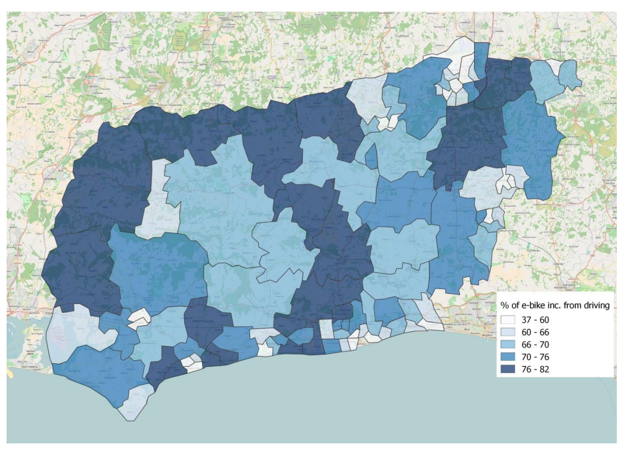
Figure 3: Figure 7 from the PCT West Sussex Case Study
On a more granular level, using the cyclestreets routing algorithms, the PCT allows a street-by-street level analysis of which roadways are most likely to see increased cycling use in these scenarios, providing an explicit target for where cycling infrastructure should be built. In the West Sussex case study, this included the A259 roadway, also called Bognor Road (See Figure 4), which the PCT projects a nearly 10 fold increase in usage under the ebike scenario. However, this is where projections and reality collide. While the estimates may show a ten fold increase, that projection includes certain assumptions about the infrastructure that may not be true. As Aldred states in her report,
“The A259 Bognor Road does already have a cycle path. As with many such paths quality is currently poor: for example, it is narrow (no overtaking, wide cycles, or commuting two abreast), only on one side of the road (crossing over part way along), and has problems at junctions (especially at roundabouts, but cyclists are also required to give way at side roads and lay-bys). While it does not have the capacity to handle the scenario increase in cycling it presents an opportunity to improve an existing facility, rather than build one entirely from scratch.”
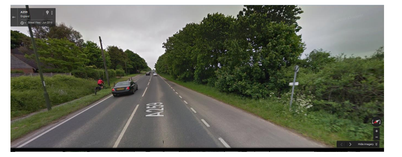
Figure 4: Bognor Road; Figure from West Sussex Case Study.
In order for Bognor Road to live up to or surpass its potential as projected by the PCT, investments will need to be made to ensure that current roads have the appropriate infrastructure in place to support travelers as they shift modes of transit from car to bike.
Strengths, Limitations, Future Work
The PCT stands apart from most statistical tools I’ve worked with or developed. I’ve seen apps (examples: 1, 2) that take the results of specific datasets, census output, or simulations and highlight the relevant descriptive or inferential information in a flexible and appealing way. When the goal is prediction, some visualization of the competing candidate models’ performance or application of the model is shown in different settings. However, I’ve never seen a tool that explicitly predicts scenarios like the PCT does. I think this is both one of its strengths as well as one of its weaknesses.
The easy-to-use interface of the PCT makes it fun and easy to look at the descriptive information on how Britons’ currently cycle to and from work. However, after clicking on the various scenarios and watching the colors of the map dramatically change to reflect the projected up-tick in cycling, I think it is much harder to understand why the new numbers are what they are conceptually. The counterfactual they’re trying to provide in these projections may not be the most appropriate and the UI makes it easy to lose track of this amidst the pretty colors.
For example, in the West Sussex case study, the authors use the coefficient estimates that describe the Dutch/Swiss e-bike propensity to cycle, applied across the different distance and graident route information in W. Sussex, to come up with the projected new propensity numbers in W. Sussex. These estimates are meant to represent the difference between Brits and their Dutch/Swiss counterparts’ likelihood to bike to work as a function of both culture and e-bike’s advantages for longer or hillier trips. Here, “culture” is meant to refer to, I think, non-infrastructure elements of Dutch/Swiss culture; generally speaking, they’re more inclined to think of a bike as an appropriate means of transport than a Brit. However, I don’t think this comparison strictly works. It seems almost assuredly true that part of the cultural differences also correspond to infrastructure differences that make biking more amenable in Switzerland and the Netherlands than England & Wales.
The authors seem aware of this in that their discussion is focused on how to invest in infrastructure so that cycling can gain greater support, but my concern is there may still be relevant differences in even the infrastructure changes proposed and those that are present from the Swiss scenario dataset that can lead to biased estimates. They’re answering the question - “How would a Swiss or Dutch person with an e-bike cycle on their infrastructure on West Sussex routes? A better question might be,”How many UK citizens aren’t biking or walking on this road for reasons related to (1) biology, (2) social-culture or (3) built infrastructure?“. The distinction between the former and latter being that the latter seeks to adjust more explicitly for the unobserved differences between the two populations. This difference in what question is being asked and estimated is sufficiently nuanced that I don’t think users of the PCT are given the time or space to think about these details, when a simple click updates the map and shows a rainbow of new possibilities. See (1) in the Appendix for more.
This isn’t to say that the PCT project isn’t worthy of effort. My criticism is very technical, intended to be constructive and in the spirit of further highlighting the importance of the larger project the PCT supports and the goals it seeks to further. To be sure, my own proposed question has its own challenges that would likely involve higher costs than the project undertaken by the PCT project. Whats more, I’m inspired by the creativity the authors demonstrate in bringing together so many different data sources to help policymakers effectively plan and invest in cycling infrastructure! In considering the specific advice Professor Aldred gives in suggesting cycling infrastructure improvements to the Bognor Road, I think that much of the fundamental advice would be the same, even if the projections were altered to take into account the nuance I describe above. In future blog posts on this topic, I hope to dive deeper into methods one could use to accomplish similar goals, and how they might compare to the great work accomplished by the PCT discussed here.
Appendix
\[\begin{equation} \begin{aligned} \text{logit}(\pi_1) &= f_4(d_{sussex}) + h_4(g_{sussex}) \\ &\text{vs.}\\ \text{logit}(\pi_2) &= f(d) + h(g) + \psi(\text{culture}) + \phi(\text{biology}) + \zeta(\text{infra}) \end{aligned} \tag{1} \end{equation}\]
In the equation above, \(f_4(\cdot), h_4(\cdot)\) are meant to refer to the functional estimates under scenario four, and \(\pi_1\) the probability estimated as a result of these functions when applied to distances, \(d_{sussex}\), and gradients \(g_{sussex}\) from West Sussex. In contrast, I’m proposing there may be a different estimate, \(\pi_2\) more closely related to the projected counterfactual of interest that would need to more explicitly account for the effects of culture, \(\psi(\text{culture})\), biology, \(\phi(\text{biology})\) and infrastructure \(\zeta(\text{infra})\). I’m posing each of these as conceptual functions here without any explicit measurement as I acknowledge that measuring and modeling these, especially culture, is no small feat.
Acknowledgements
Thanks to Paul Haluszczak and Robert Svoboda for reading and offering comments on this article.